A new era deserves a new symbol, and The University of Texas at San Antonio’s has arrived.
![]()
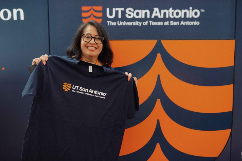
Our university’s new logo represents the intentional convergence of two proud legacies: The University of Texas Health Science Center at San Antonio and The University of Texas at San Antonio. Unveiled as part of the launch of the unified institution, which becomes official Sept. 1, the mark was designed to do more than look modern. It was created to carry meaning.
Shaped by purpose
The logo is just one part of the merged university’s new brand identity and narrative, approved by the UT System Board of Regents in May. The brand is the product of months of work by the Brand and Marketing Task Force, established shortly after the announcement of the merger in August 2024.
The task force, along with four working groups, is made up of dozens of representatives from UT San Antonio and led by Heather Adkins, senior vice president and chief marketing and communications officer and Anne Peters, associate vice president for marketing and special projects.
There were more than 300 faculty, staff, students and alumni and community members engaged in the brand creation.
University logos vary in complexity and tone, and are shaped by history, audience and institutional mission. The UT San Antonio logo was crafted to reflect our brand principles — those staggering truths that we believe in as we grow in size, scope and scale, the strength of the combined legacy universities and the energy of the integrated institution’s shared ambition.
The new logo pairs the branded name UT San Antonio with a bold, upward-facing icon in UT San Antonio orange, Pantone 1665 (the universal color-matching standard). The icon’s stacked form, reminiscent of crested waves or a stylized fountain, draws inspiration from the San Antonio River Basin. The shape is intended to represent flow, energy and the confluence of people, ideas and impact.
The upward arrow at the base of the mark evokes momentum, aspiration and transformation, capturing the promise of a university that serves as a launchpad for the future.
The shield that holds it all together is an emblem of trust, academic rigor and protection. Its presence in the logo honors the longstanding visual identity of The University of Texas System, signaling the continuity of UT San Antonio’s standards of care, training and service to South Texas and across our great state.
Even the typography is intentional and significant. The modern sans serif font is confident and clear, while subtle “spur serifs” on the ‘A’ and the ‘Ts’ pay homage to Texas roots.
It’s a foundation
“Our goal was to create a logo that visually translates our values: excellence, innovation, care and community,” said Brand and Marketing Task Force member Eddie Tamez, a manager of brand and creative design at the Health Science Center. “It had to feel at home in both legacy institutions. At the same time, it had to be strong enough to carry us into what comes next.”
The logo’s development followed an in-depth evaluation process, guided by four key requirements. It had to visually represent the brand strategy for UT San Antonio and distinguish the university regionally and nationally. It also had to embody the university’s ambition for growth and impact while being versatile across all platforms and uses.
That overall brand strategy was anchored by the university’s five guiding principles:
- Society’s biggest challenges are our everyday work.
- Education is the greatest health initiative of all time.
- Intellectual generosity expands opportunities.
- We maximize both access and excellence
- Our community is a model for the future.
Together, these principles shape how the university shows up for its students, employees and the region. Now, through its new logo, it shows how it presents itself to the world.
Faculty, staff and students can find more information about official logo usage guidelines to ensure consistency across digital and print materials by visiting the Employee Resource Files at UTSanAntonioTogether.org.
“Initial uses of the UT San Antonio logo in the fall of 2025 will focus on the parent brand only,” said Jennifer Bittle, the Health Science Center’s senior director of brand and creative services. “Full brand migration is expected to take up to two years as we thoughtfully design our implementation processes and governance of our new brand. Logos for schools, colleges, research entities, divisions, support offices, units and so forth will be implemented through a strategic migration plan. Explicit implementation instructions and guidelines will be provided to each unit, and there should be no modification of logos in the meantime.”
When used correctly, a successful logo builds recognition, reinforces the institution’s values and presents a unified identity to the world.
Honoring the past, igniting the future
While the new logo will represent the academic excellence, discovery and public service of the merged UT San Antonio, the two-tone orange “Alamo shield” of UT Health San Antonio will remain to represent the clinical enterprise.
Additionally, the university’s Athletics brand will remain the same, identifying as the UTSA Roadrunners and utilizing the Rowdy mascot logo.
“The new logo for The University of Texas at San Antonio was created to reflect the launch of a significantly more comprehensive institution — one that combines the strengths of a preeminent, research-intensive academic health center and a large, top-tier research university,” Bittle said. “Rather than reuse an existing logo, the decision to create a new graphic mark was intentional, signaling that this is not simply a continuation of either legacy institution, but the beginning of something greater.”
The logo reflects the merged university’s role as a launchpad for discovery, learning and care — and its emergence as the third-largest research university in Texas, Tamez added.
“It’s important to remember that the logo is just one piece of a much larger story. Our new brand reflects the bold future we’re building together — a unified institution that brings together education, research and healthcare at an unprecedented scale,” he said.
This fall, UT San Antonio will unveil a local, regional and national advertising campaign to showcase the impact of the merger and the value it brings to San Antonio, Texas and the nation.