Ever wonder why The University of Texas glows in shades of orange — why that hue materializes on lapel pins, lab coats and lawn chairs across our state? Our favorite citrus-tinted color isn’t just a design choice; it’s a 140-year-old story about identity, optimism and, yes, a little friendly football folklore.
Orange first appeared in 1885, when a group of UT Austin students purchased the cheapest ribbon they could find, an overlooked string of orange paired with white from a local haberdasher. They were headed to a baseball game against Southwestern University and wanted a way to show their school spirit. At the time, wearing school colors as ribbons pinned to clothing was a popular tradition at collegiate events.
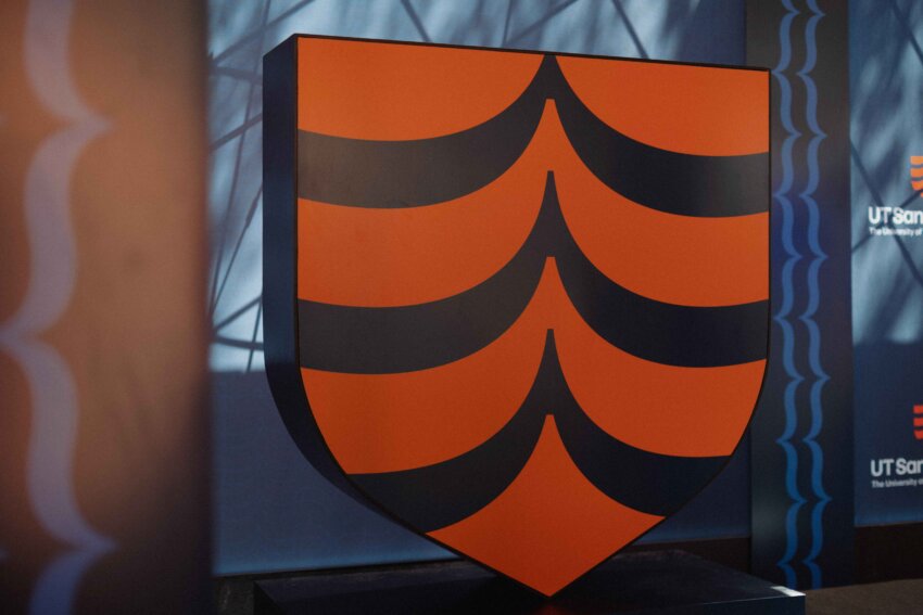
Over time, wash cycles and dye lots darkened the shade into today’s iconic burnt orange, or “Texas Orange,” formally protected as Pantone 159 (the universal color-matching standard) and nationally trademarked by UT Austin.
A popular piece of lore surrounding Texas Orange is that Coach Darrell K. Royal embraced the darker tone so the football would blend into players’ jerseys — a competitive edge that was, in all likelihood, more myth than master plan.
One system, many oranges
The UT System Board of Regents later encouraged every UT institution to include orange somewhere in its palette. The logic was simple: A shared color would visually connect institutions across the state while giving each campus room to express its unique personality.
That’s why UT Dallas pairs an energetic orange with forest green, UT Permian Basin goes bold with orange and black, and UT Rio Grande Valley combines its vivid orange with a sleek gray. Even so, the UT System has affirmed Stephen F. Austin University’s right to retain its historic purple and white when it transitioned into the system in 2023. The decision honors the university’s legacy, warmly welcoming it into the broader UT family.
The thread is unmistakable: When Texans see orange, they know they’re in Texas country — whatever the shade, whatever the mascot.
UT Health San Antonio’s own color journey has been just as vibrant. Senior Director of Brand and Creative Services Jennifer Bittle remembers the 1990s, when the only “logo” was the university seal in a bright orange stitched onto white coats.
“It was a different time for branding,” Bittle said. “We didn’t have a unified visual system yet, but there was a strong desire to reflect our UT affiliation and stand out in clinical settings.”
Everything changed with the “hexagon era,” when a deeper, almost-burnt orange linked the institution visually to the flagship while giving a nod to each school through its own secondary hue. In 2016, a full UT Health San Antonio rebrand introduced the “Alamo shield” logo with two oranges, a stately base plus a sunnier accent, signaling that orange wasn’t a mere trim; it was the heartbeat.
The opening of the UT Health San Antonio Multispecialty and Research Hospital last December let designers push the color palette even further to distinguish our growing institution.
“We embraced San Antonio Sunrise, a gradient that runs from golden yellow to tangerine,” Bittle said. “It feels optimistic, uplifting. That’s exactly what you want in a healing environment.”
That shade now colors every patient care line from sports medicine to oncology to dentistry.
Orange 3.0
Fast-forward the launch of the merged University of Texas at San Antonio on Sept. 1, 2025.
A task force of brand designers, strategic communicators and marketing specialists from both UT Health San Antonio and UTSA worked with a consulting brand firm to create a new brand and logo, approved by the Board of Regents in May. Task force members interviewed more than 300 internal faculty, staff, students and residents, alumni and community members to crown a bold, modernized orange as the leading hue — a shade bright enough to stand out across the UT System yet warm enough to feel unmistakably San Antonio, technically called Pantone 1665.
While the new color palette represents the academic identity of The University of Texas at San Antonio, UT Health San Antonio’s existing brand and visual identity, including its Alamo shield logo and color palette, will remain in place for the clinical enterprise. This distinction ensures continuity and recognition across patient care settings while allowing the academic brand to evolve under the new unified institution.
The following colors make up the new academic palette for UT San Antonio:
- Complementary orange. Two tints allow legacy brands — such as UT Health San Antonio’s Sunrise gradient, Pantone 1525 — to keep their visual equity while sliding smoothly into the new university’s larger palette.
- Confident blues. Deep and mid-tone blues ground the palette, echoing UTSA’s original blue and providing strong contrast for digital accessibility.
- Pops of vibrant accent tones. Bright corals and sunset tones draw inspiration from the city’s artistic energy and cultural mix.
The result is a comprehensive color palette and design system, crafted to serve a nationally prominent university whose enterprise spans lecture halls and recital stages, advanced research laboratories, championship athletic fields and world-class patient care environments.
“We wanted a spectrum that unifies without flattening anyone’s legacy story,” Bittle noted. “It’s one that honors Roadrunner pride, keeps San Antonio Sunrise in clinics and signals to the world that something distinctly San Antonio, and distinctly UT, is happening here.”
To learn more about the history and evolution of “Texas Orange,” check out this deep-dive article.